Project Brief
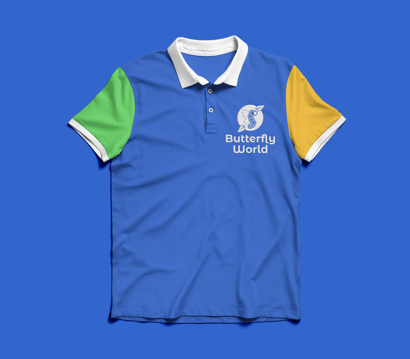
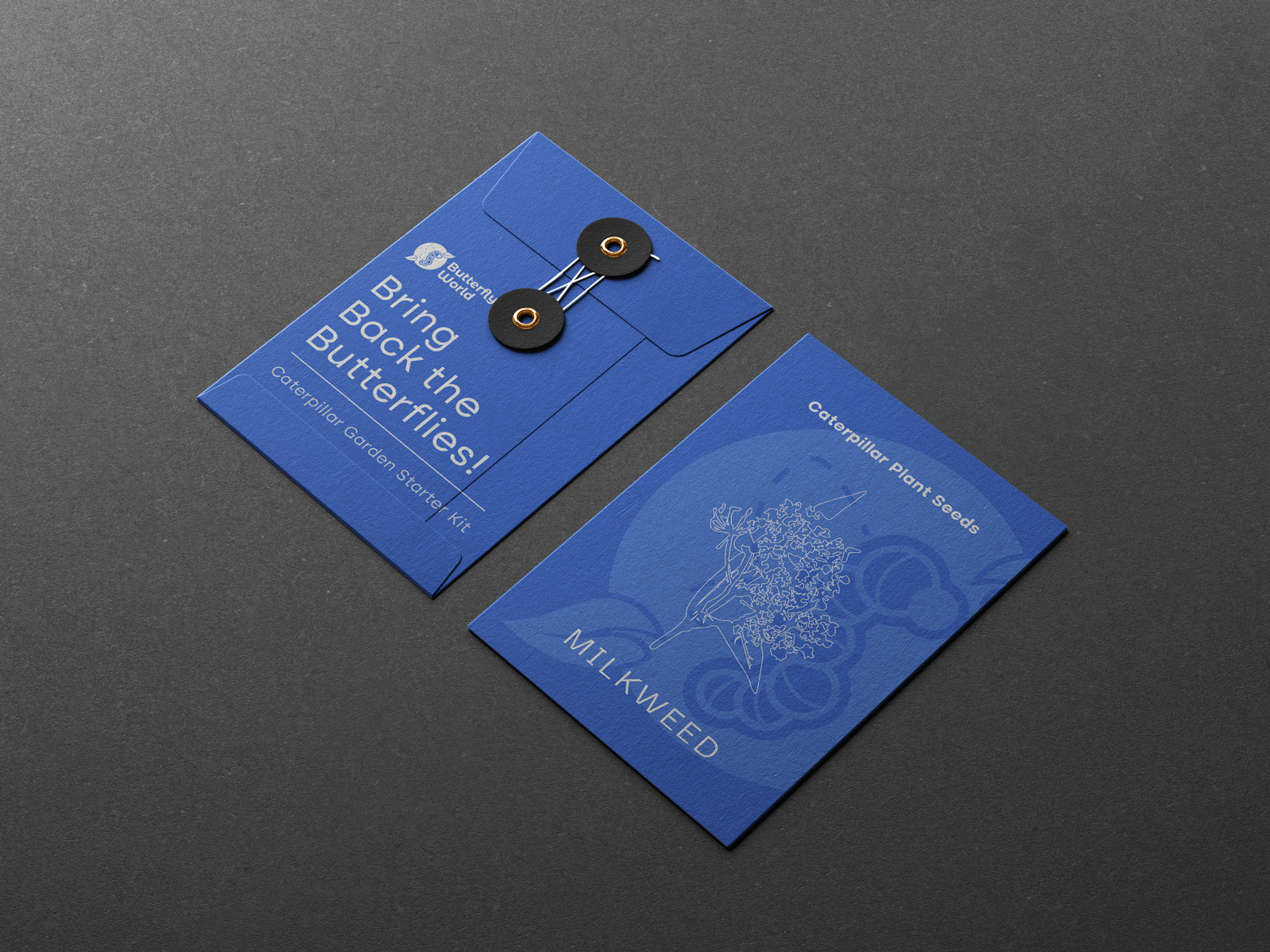
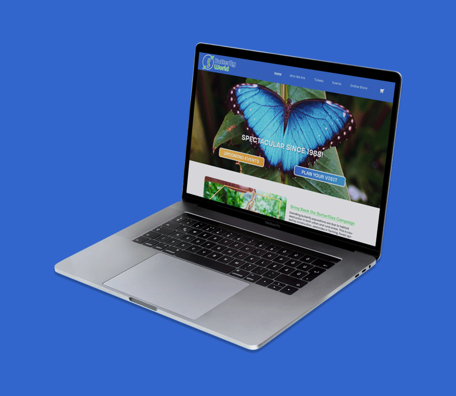
The Butterfly World Redesign + Ad Campaign project goes about creating a more modern but family friendly identity for the largest butterfly conservatory in the world. In addition to that, developing a campaign of advertisements that encapsulates the BBB philosophy (Bring Back the Butterflies).
For additional context, the first half of the project focuses on conducting an extensive research on company background, target markets, vibe, mood, visuals, and other base information as a group. For this part I was grouped up with B. Lopez and J. Perry.
Tools: InDesign, Illustrator, Photoshop, Figma, Google Sheets
Timeframe: February 4, 2023 - April 24, 2023 (11 weeks)
Deliverables:
Week 1 through 3 - Research (Background, Target Market, Vibe, Mood Boards, Demographics)
Week 4 - Group presentation
Week 5 - Branding (color palette, logo)
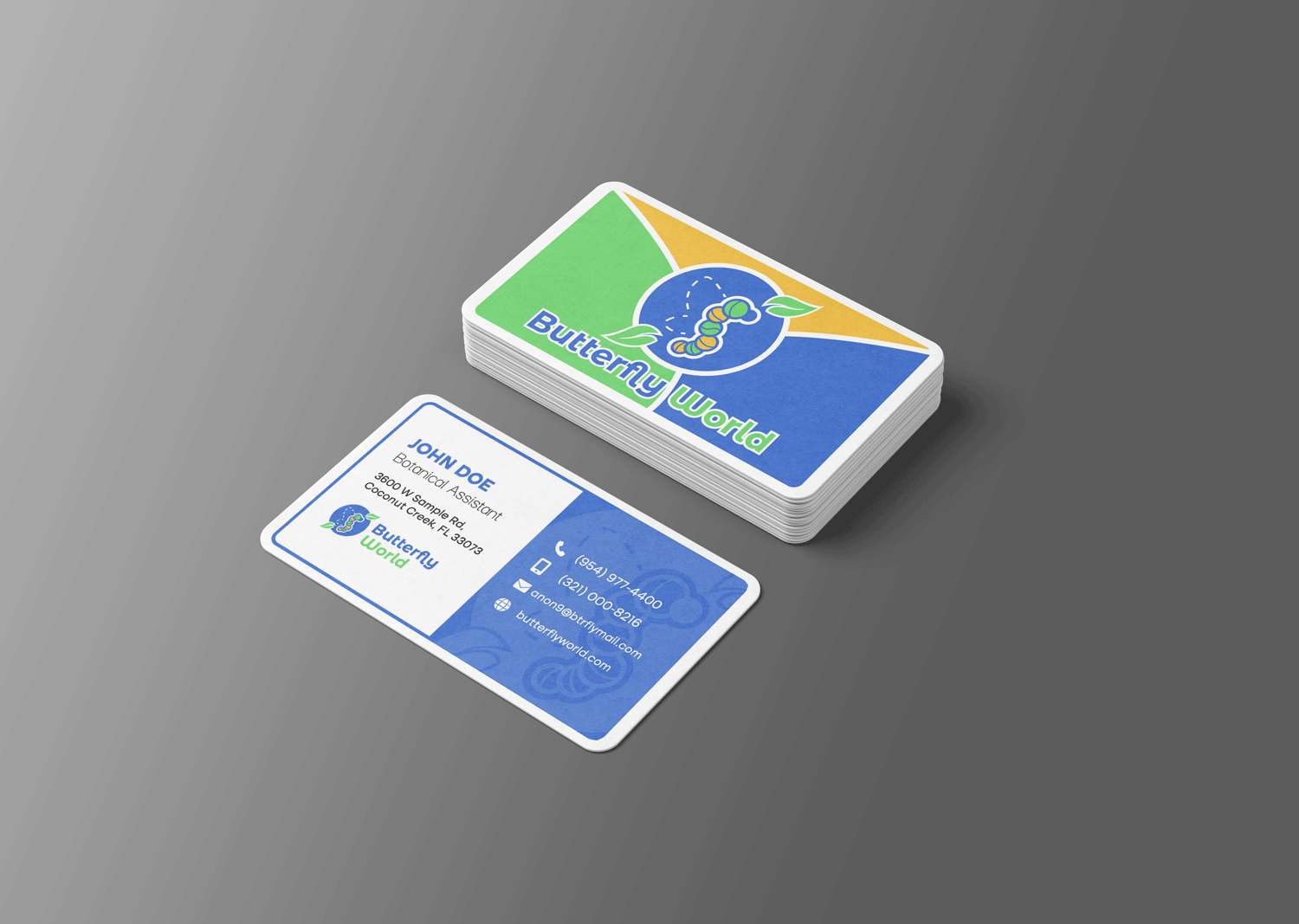
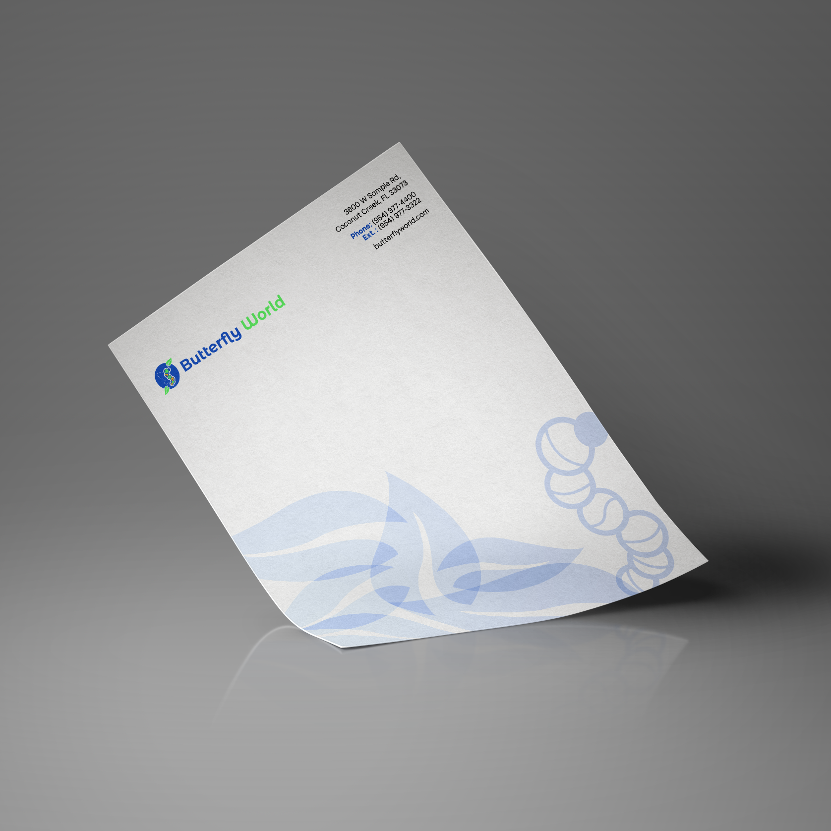
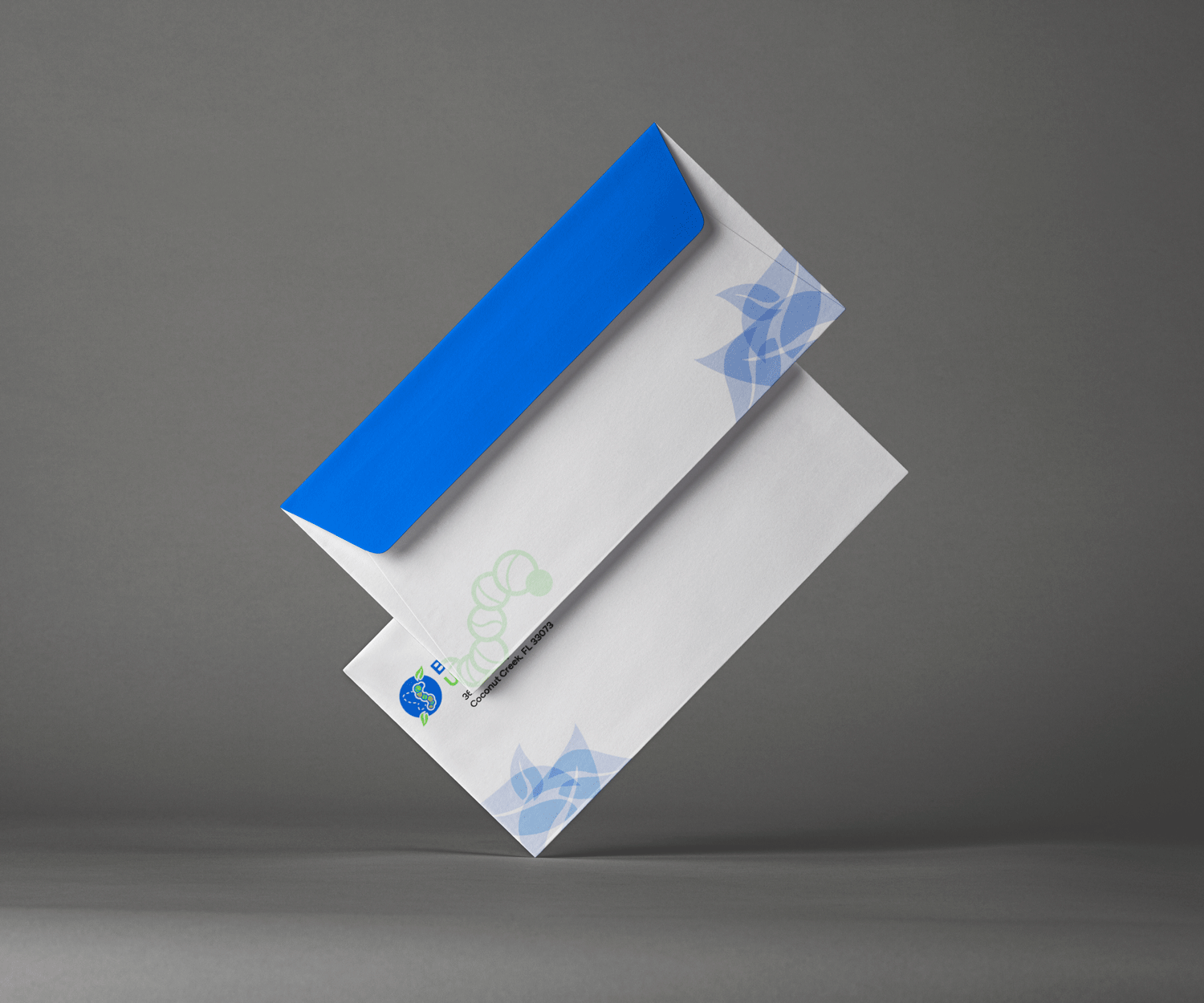
Week 6 - Stationery (business card, letterhead, envelope
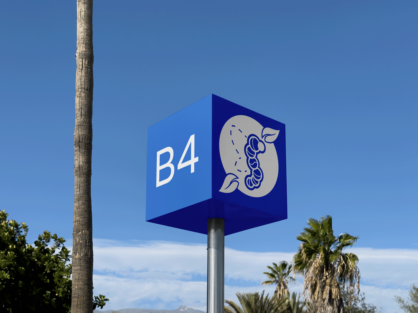
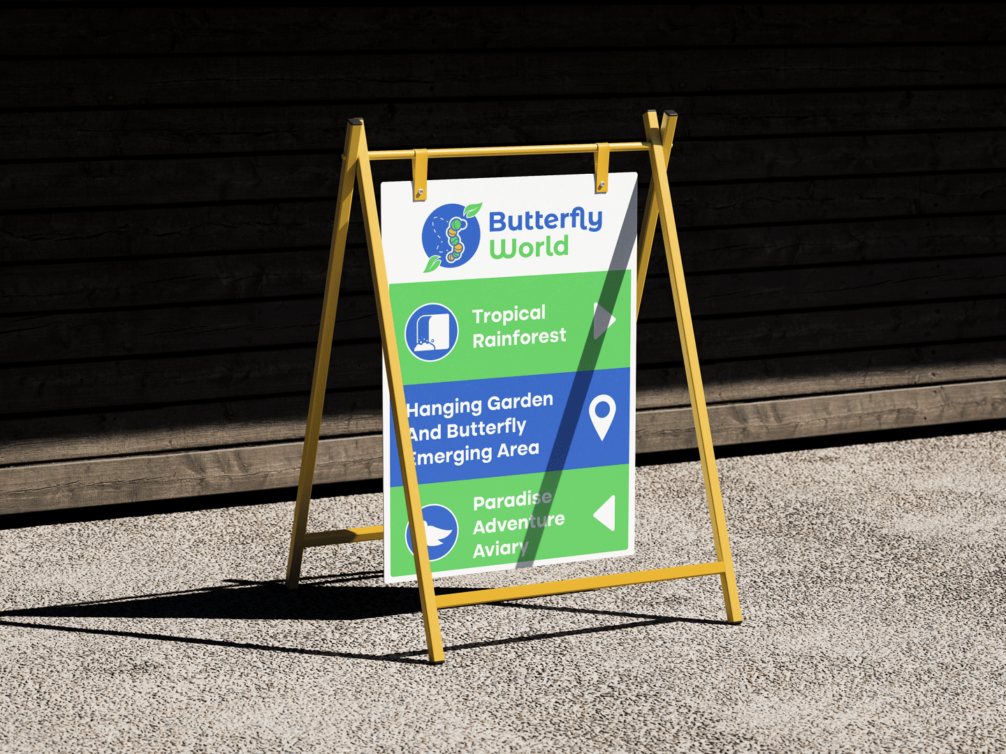
Week 7 - Environmental Signage
Week 8 - Visitor Guide
Week 9 - Ad Campaign Concepts
Week 10 - Composition of website Home Page redesign
Week 11 - Client Presentation
